Your logo is often the first thing people notice about your business. Before they read your content, explore your services, or contact you, they see your logo. In 2026, where competition is high and attention spans are short, a professional logo can instantly build trust—or push customers away.
A strong logo is not just about looking good. It represents your brand identity, values, and credibility. When combined with modern tools and automation, professional logo design also helps maintain consistency across websites, social media, packaging, and marketing campaigns.
This guide covers practical logo design tips that make your business look professional, memorable, and trustworthy.
Why a Professional Logo Matters
A well-designed logo delivers real business benefits:
- Builds instant credibility and trust
- Makes your brand recognizable
- Differentiates you from competitors
- Supports consistent branding across platforms
An unprofessional logo can signal inexperience, even if your product or service is excellent.
Core Logo Design Tips for a Professional Look
Keep the Design Simple and Clean
Simplicity is the foundation of professional logo design.
Best practices:
- Avoid clutter and excessive details
- Use clean shapes and balanced spacing
- Ensure the logo is readable at all sizes
Simple logos are easier to remember and scale better across digital and print platforms.
Choose the Right Colors Carefully
Colors communicate emotions and brand personality.
Tips for color selection:
- Use 1–3 primary colors
- Choose colors that match your brand values
- Ensure good contrast for readability
Automation tools can enforce color consistency across all brand assets, replacing manual checks.
Select Fonts That Reflect Your Brand
Typography plays a major role in professionalism.
Font guidelines:
- Avoid overly decorative fonts
- Use clean, legible typefaces
- Limit font usage to one or two styles
Modern design systems automate font usage across websites and marketing materials
Design for Scalability and Versatility
Your Logo Must Work Everywhere
A professional logo should look good on:
- Websites and mobile apps
- Social media profiles
- Business cards and packaging
- Ads, banners, and emails
Manual resizing often breaks proportions, while automated brand systems generate correct logo variations instantly.
Use Vector Formats
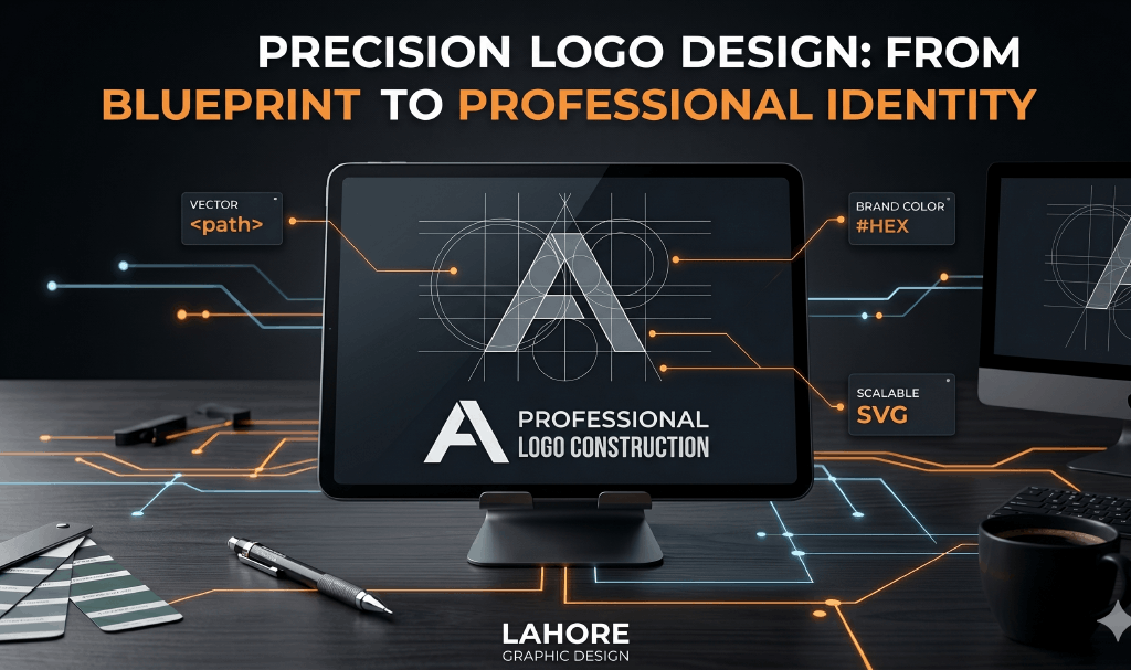
Vector logos maintain quality at any size.
Benefits:
- No pixelation
- Easy resizing
- Perfect for print and digital use
Automation tools can export logos in multiple formats without manual redesign.
Manual Operations vs Automation in Logo Design
Example: Logo Usage Across Platforms
Manual Approach:
- Different logo versions saved separately
- Manual resizing for each platform
- Risk of outdated or incorrect logos
- Inconsistent brand appearance
Automated Approach:
- Centralized logo library
- Auto-generated size variations
- Brand rules applied automatically
- Consistent professional look everywhere
Automation saves time and protects brand integrity.
Logo Design and Brand Trust
Professional logos increase trust by:
- Showing attention to detail
- Creating visual stability
- Making your brand look established
Inconsistent or low-quality logos reduce credibility, especially for new businesses.
Common Logo Design Mistakes to Avoid
Avoid these pitfalls:
- Using too many colors or fonts
- Copying competitor logos
- Following short-term design trends
- Ignoring scalability and readability
Automation tools help enforce best practices and prevent errors.
Case Study: Amateur vs Professional Logo Design
Amateur Logo (Manual):
- Low-quality visuals
- Inconsistent usage
- Poor scalability
- Weak brand recognition
Professional Logo (Automated):
- Clean, scalable design
- Consistent branding everywhere
- Faster marketing execution
- Strong trust and recall
Conclusion:
Your logo is not just a graphic—it’s the face of your brand. In 2026, professional logo design combined with automation helps businesses look credible, consistent, and competitive.


